AESTHETIC USABILITY EFFECT – WEEK 1
QUESTION 1
The article ‘Aesthetic-Usability Effect’ explores the idea around user’s engagement and perception based on the aesthetics of designs of particular products- users “perceive attractive products as more usable. People tend to believe that things that look better will work better — even if they aren’t actually more effective or efficient” (Moran, 2017). The article provides an affirmative argument that aesthetic designs are more accepted by users as they are more willing to actively engage in the information and/or product being produced and therefore accumulating a higher probability of the product being used (Chakraborty, 2017).
As well as a more aesthetic design the article further discusses that it also fosters a positive attitude from users which overall increases the success of the design. Further research suggests this idea of the ‘Aesthetic-Usability effect’ is constantly implemented in systems such as websites- as various organisations that are either selling/promoting products or various systems strive for more aesthetically pleasing designs and therefore a more usable platform for users.
Overtime, from when the first website was ever introduced on the world wide web in the 1990’s- as we see today the design of these websites were very low standard to what we expect in the 21st century (Lawrence, Tabakol, 2007). The design approaches initially more simplistic with not much colour or patters and rather focusing on text and not the visual aspect- which is what has been proven to attract consumers. Later there was a surge of interests and investment in the WWW across societies- and soon enough websites were faced with consumer expectations and a rather extensive technical change with how they operated in order to construct more aesthetic, engaging and commercially accepted designs.
The functionality of a design- such as the interface of a product such as a computer needs to have the necessary functions in order for sufficiently usability as it needs to perform the tasks for which is is intended to do. If this function are not usable then this leads towards consumer dissatisfaction. Consumers as an expectation these days are not willing to accept difficulties in interacting with products (Jordan, 2000).
QUESTION 2
PHONES
Smartphone devices have become an everyday item in our society today and overtime mobile phone companies have technologically enhanced in their aesthetics design and overall usability. This product meets the ‘Aesthetic Usability effect’ as phone designs have enhanced, such as brands such as Apple. However, this effect is at its strongest when the aesthetics serve to support and enhance the content and functionality of the product which Apple has driven to achieve (Chakraborty, 2017).
Overtime, Apple has significantly developed its physical design. These changes includes the sizing and home screens interface, these changes have been made in order to appeal to customers needs and expectations for constant updates of new aesthetic designs and its physical usability. Since the introduction of the iPhone in 2007, the interface of the smartphone today has been changed significantly since the first iPhone 3.
Firstly, the iPhones have increased in size (though also provide a ‘plus’ version of the iPhone) of the screen so that users are able to view their smartphones on a larger surface space, making the visual design of the iPhones applications and functions more usable. Additionally, the phones home button has been removed from recent releases of the iPhone (including the new iPhone X and XR) making the screen again a larger cleaner surface with zero clutter- purely transitioning the iPhone to all touch screen phone.
The iPhone as also been known over the last 10 years, to improve the weight of the device. Due to decreasing the width of the phone Apple has successfully produced a sleak and modern phone which continues to please customers to date. Overall, smartphones overtime, develop and improve the aesthetic design and usability of the iconic device, as stated by Steve Jobs, creator of Apple (as sited in Isaacson, 2012), “The way we’re running this company, the product design the advertising, it all comes down to this: Let’s make it simple. Really simple”.
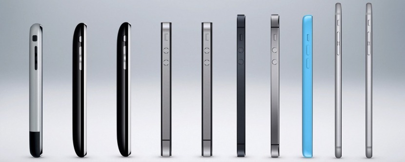
(The Evolution of the iPhone: Every Model from 2007–2018, 2018) 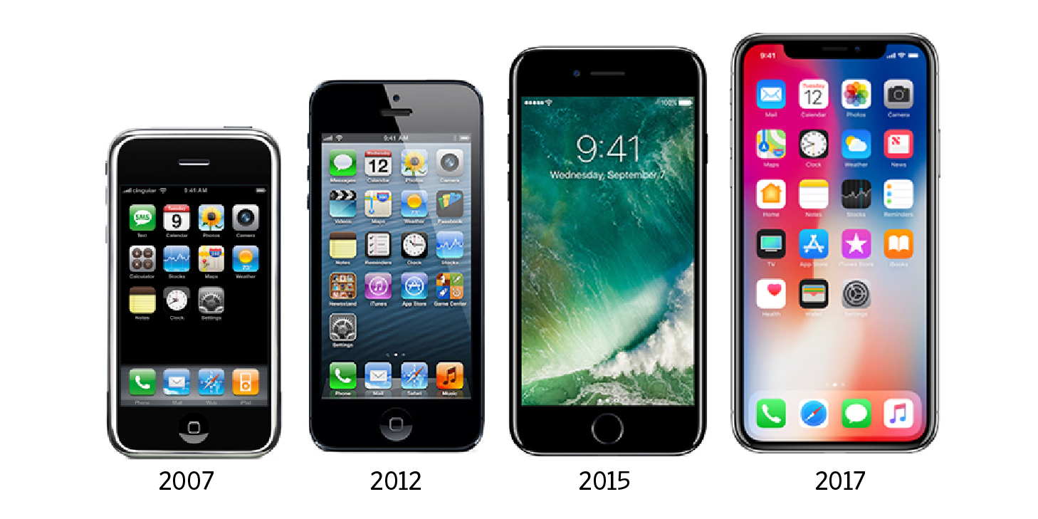
(The iPhone Evolution, 2018)
COMPUTERS
Similar to smartphones such as Apple’s iPhone, laptops/computers have modernised overtime due to the development in the evolution of media technologies and hence meet the aesthetic usability principal. Computers have transitioned from these large limited machines which are now seen as less aesthetic and usable. Computers have become lighter in size and more aesthetically pleasing through its slick and modernised design. Due to the improved designs, laptops have become portable and efficient to use hence meeting the aesthetic usability principal.
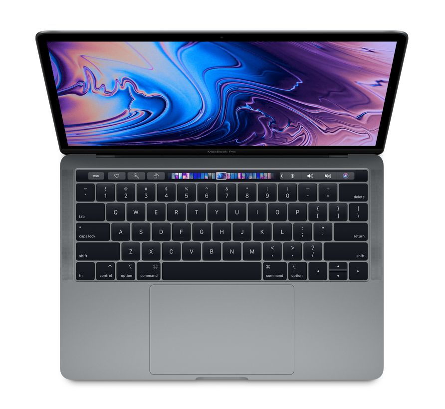
Computer brands such as Apple, meet this effect evident in their current range of Apple Mac Pros which include a touch bar on the key pad section. This allows its users to easily access functions quicker and more efficiently- this has evidently shown that computer designs have been improved for better usability of the product by users, as well as also being visually engaging for potential users. “The extent to which a product can be used by specified users to achieve specified goals with effectiveness, efficiency, and satisfaction in a specified context of use” (Punchoojit, Hongwarittorrn, 2017).
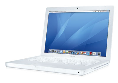
Apple has also released various colours for the MacBook’s, again a development from the initial release of the Apple MacBook in 2006. The original silver design has been modernised overtime, to now produced in rose gold and space grey. With these improvements in the aesthetic design of the product, the laptops are given a higher probability of being used (Lidwell, Holder and Butler, 2003, p. 18). Additionally, to a larger range of colours making. The products design more visually engaging, the MacBook since initial release has decreased in weight though increased in various technological capabilities including processing speed, memory and graphics. These are all significant factors for long term usability of the product and overall success of the design.
CARS
Cars are products found in everyday surroundings which meet the aesthetic usability effect. Overtime, as this product has modernised the designs of cars have become more aesthetically pleasing and improved with enhanced technology such as GPS, cruise control, motion sensors etc. All which has been implemented for better user usability.
Designs in relation to products have been made more aesthetic for the aim of higher probability of the product being used. “Aesthetic designs have been perceived as easier to use” (Lidwell, Holder and Butler, 2003, p. 18), the authors are correct in this sense, as cars and other modes of transportation have been developed both aesthetically and functionally due to the enhancement of technology and car performance in the last 20 years. Though first impressions of a cars visual design draw users to believe that because the product provides a sleek and modern image, it is in fact easier to function.
With the addition of new technologies which is constantly developing in our vehicles today such as GPS tracking, bluetooth, cruise control and motion sensors in cars, these vehicles have become more efficiently functional and further aesthetically pleasing. Again the aesthetic usability effect is met as users are attracted to the product because of this aesthetic designs which implies the impression that it is easier and more efficient to use regardless if it’s not.
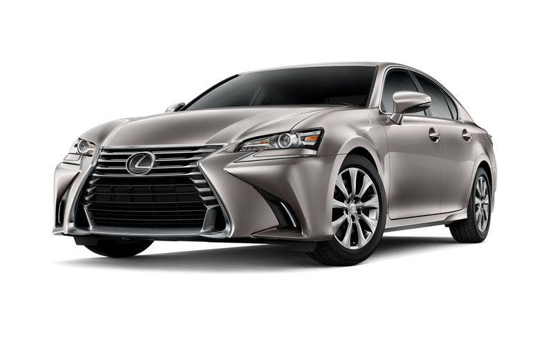
Car and Driver Lexus, 2019) 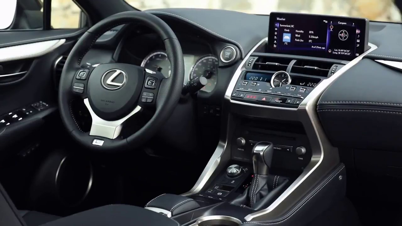
(reddit, 2018)
References
Punchoojit, L., & Hongwarittorrn, N. (2017). Usability Studies on Mobile User Interface Design Patterns: A Systematic Literature Review. https://www.hindawi.com/journals/ahci/2017/6787504/
Jordan, P. W. (2000). Designing Pleasurable Products- An Introduction to the New Human Factors (Publication no. https://doi.org/10.1201/9780203305683). https://www.taylorfrancis.com/books/9780429219962
Lawrence, D., & Tavakol, S. (2007). Balanced Website Design: Optimising Aesthetics, Usability and Purpose.
Chakraborty, A. (2017). The Aesthetic-Usability Effect: Why beautiful-looking products are preferred over usable-but-not-beautiful ones.
Moran, K. (2017). The Aesthetic-Usability Effect. https://www.nngroup.com/articles/aesthetic-usability-effect/
Image References
Apple (2019). 13-inch MacBook Pro [Photograph]. Retrived from https://www.apple.com/au/shop/buy-mac/macbook-pro
Apple-history/MacBook (2015). MacBook [Photograph]. Retrieved from https://apple-history.com/mb
Car and Driver (2019). Lexus [Photograph]. Retrieved from https://www.caranddriver.com/lexus
Reddit (2018). r/Lexus [Photograph]. Retried from https://www.reddit.com/r/Lexus/comments/8x0es3/why_does_the_new_lexus_nx_have_the_worst_interior/
The Wall Street Journal (2019). The iPhone Evolution [Photograph] retrieved from https://www.wsj.com/graphics/iphone-evolution/
iPhoneLife Magazine (2018). The Evolution of the iPhone: Every Model from 2007–2018 [Photograph] retrieved from https://www.iphonelife.com/content/evolution-iphone-every-model-2007-2016
CONSISTENCY – WEEK 2
QUESTION 1
The article discussing the principal of consistency explores the usability of a system/product and how there are various principals of consistency in designs. Implementing this idea of consistency allows for users to learn faster and focus in the content being presented to them. The article discusses four types of consistency: aesthetic, functional, internal and external. Aesthetic consistency regards the style and look of a particular product and design, as an example each car model and brand have a particular logo which is particular to their car. So, when users and potential buyers see the logo they immediately recognise it and determine the look and style of the car with its brands logo.
Secondly, functional consistency is the repetition of a system or product. With this consistency users become familiar with how they work as it becomes easier to learn by other users and increases overall usability. The author goes on to discuss the principal of internal consistency where designers purposefully group elements of a particular design and ensuring they are consistent with one another- such as “eg., signs within a park are consistent with one another” (Lidwell, Holder and Butler, 2003, p. 46) allowing users to clearly understand the particular systems functions. Through this ‘grouping’ of particular elements within a design it is aesthetically acceptable for users.
On the other hand, external consistency are various independent elements within a particular design system or environment which have consistent designs. “eg., emergency alarms are consistent across different systems in a control room” (Lidwell, Holder and Butler, 2003, p. 46). The article pays particular attention that users can apply knowledge that they’ve previously known to the new context, when trying to operate or understand the functions of another system. This use of consistency provides a greater user experience and increases usability. Similarly, in a study of the affects of similarity and consistency regarding mobile portal services, it was discovered that consistency indeed had a positive affect on usability and also credibility, and consumers’ perception of this (Jongtae, Dongwon, Junghoon & Mycong-Cheol, 2013).
The article I believe is valid as the author provides specific listed points for the readers and further backs up these statements with examples of each type of consistency- such as the Mercedes car logo was formed and is recognisable today due to aesthetic consistency. The author also uses relatable examples of design principals users would see in everyday life.
Overall, these principals of consistency discussed in the article in relation to product design are incorporated for easier user use, as it allows users to learn, accept and function more effectively. Inconsistent designs will cause confusion which will then lead to a decrease in usability as users will become frustrated- designers must uses these principals of consistency in order to keep their systems or products simple and consistent (Nikolov, 2017). “In short, usability and learnability improve when similar elements have consistent look and function in similar way” (Nikolov, 2017). This is seen within webpages, which must be clear and precise, to the point and consistent in order for user to be able to use the sites “efficiently and effectively” (Cappel & Zhenyu, 2007). Usability in a web context is defined as “a quality attribute that assess how easy user interfaces are to use” (Cappel & Zhenyu, 2007).
QUESTION 2
APPLE PRODUCTS
Apple has implemented the principle of consistency through their overall visual design and functionality. With all apple products including the iPhone, iPad and the MacBook’s, Apple has been consistent with the design of the interface and the overall physical aspects of the devices. With this sleek and aesthetic design, Apple has transformed the company into a world-wide creditable brand. Aesthetic consistency is again met through the brands iconic logo placed on the back of the device (iPad, iPhone) or on the front of the computer screen. The ‘apple’ icon which represents the brand name is featured on all Apple products making them “instantaneously recognisable because of the company consistently features its logo” (Lidwell, Holder and Butler, 2003, p. 46).
Functional consistency is met throughout all Apple products, as users are able to easy function various Apple products which ease. All applications such as searching platforms, email, messages, photos etc, are consistent through these various products allowing users when learning how to use and operate a new product or specific application with ease. Stated by Steve Jobs, creator of Apple (as sited in Isaacson, 2012), “The way we’re running this company, the product design the advertising, it all comes down to this: Let’s make it simple. Really simple”.
Overall, Apple products evidently meet the principals of consistency which implements familiar standards and models by using interface elements, well-known icons, standard text styles and uniform terminology (Badashov, 2017).
(iShop, 2019) 
(LappyPhone, 2019)
ADOBE SOFTWARE PRODUCTS
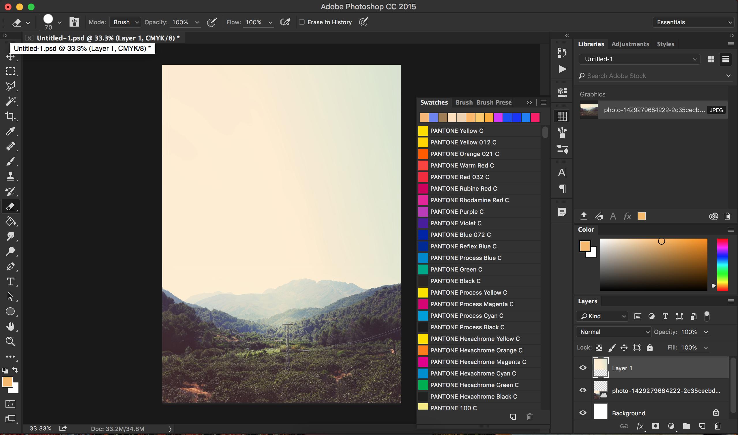
The adobe software is a digital range of applications which are used for digital design and creation. The software has implanted the principle of consistency throughout the software’s functionality and aesthetics. The aesthetic consistency through the software is shown through its interface- across all products various applications are similar to others due to its look. Products such as Photoshop and Lightroom CC have similar layouts in its internal design providing a better experience for users when they try and learn how to use other apps.
As well as the applications internal design, the Adobe software’s are recognised by its icon. Each application (Premier Pro CC, Lightroom, Photoshop, After Effects etc) have the same logo but what differs the software’s is the colour and the two letters on the application which differentiates the products name, such as Adobe Premier Pro which is named with the letters (Pr). An example is shown below:
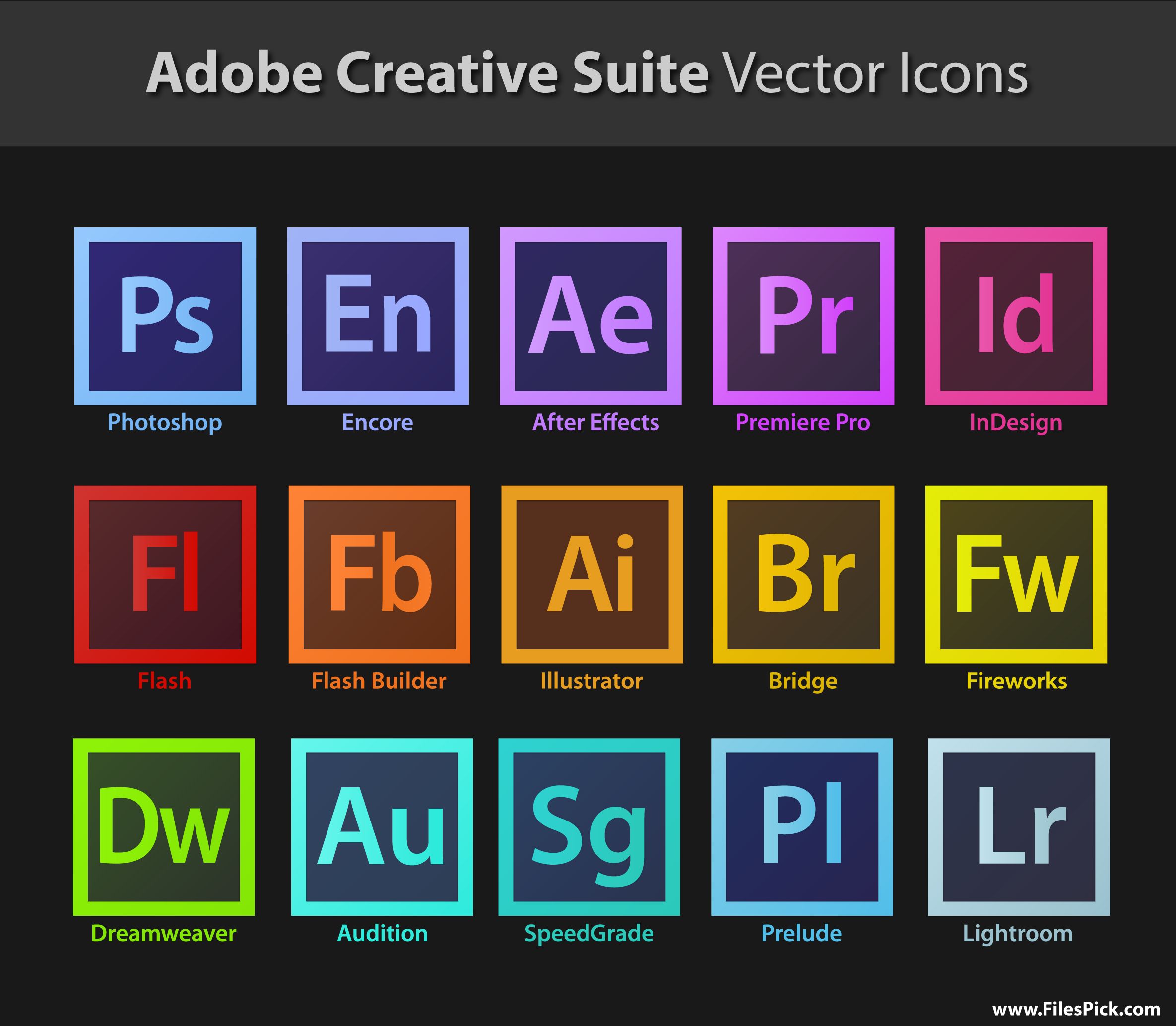
(Pinerest, 2019)
As well as the aesthetic consistency seen within this product, the software’s functions are very interchangeable from one adobe product to the other. “The consistent use of the symbols on new devices enables people to leverage existing knowledge about how the control functions , which makes the devices easier to use and learn” (Lidwell, Holder and Butler, 2003, p. 46), this is evident with the Adobe products as once learned the functions of one adobe product users can transfer this prior knowledge and skills to other adobe software (UX Theory Handbook, 2017).
Products such as Photoshop and Lightroom- although the applications may not seem intuitive once leant it becomes easier for users to learn the functionality of the other related applications. The interface of the systems provides a consistent design through all Adobe products which allows users to use the products smoothly and with minimal complications.
(Crack How, 2019) 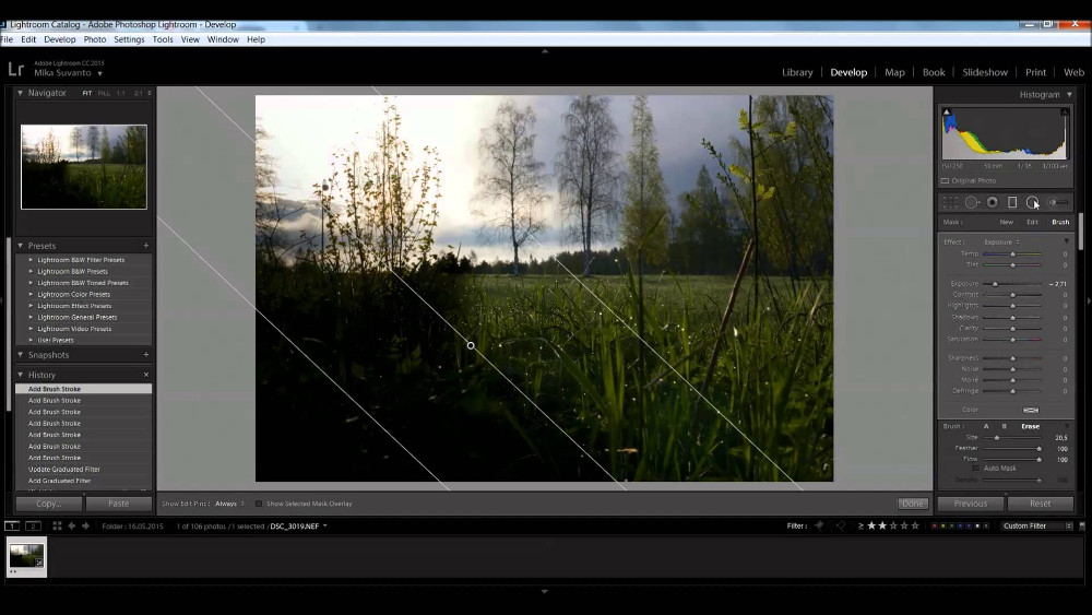
(Getpcsoft Wikisend, 2019)
Facebook was first introduced in 2004 but wasn’t until 2006 that the social media platform became stickily for people 13 years of age and older and the product instantaneously took off. Facebook is an everyday ‘product’ used by majority of the population and meets the principals of consistency. This is evident through its success attributed to its “ability to appeal to both people and businesses and its ability to interact with sites around the web by providing a single login that works across multiple sites” (Nations, 2019)- this success if purely lead by its functionality and aesthetic consistency.
The aesthetic consistency implemented in the product refers to the consistent style and appearance of the product. Since 2004, the introduction of the social media platform the recognisable blue and white ‘f’ logo was first introduced to the mass media audience. As soon as the product took of globally, the design of Facebook remained the same, the overall visual design is clean and blank, “a minimal, well-lit space encourages participation and honest transparent communication” (Badashov, 2017).
The social media platform is “more utility than entertainment, meant for repeated daily use, providing value efficiently” (Badashov, 2017). This is why Facebook has created a streamlined platform, purged of unnecessary clicks and wasted space in order to an efficient user experience (Handbook, 2017). The product has reached great success due to its implementation of great consistency’s through its design and functionality.

(Facebook brand resource centre, 2019) 
(MakerMoon, 2019)
References
Cappel, J., & Zhenyu, H. (2007). A usability analysis of company websites. The Journal of Computer Information Systems, 48(1), 117-123.
Jongtae, L., Dongwon, L., Junghoon M., & Mycong-Cheol, P. (2013). Factors affecting the perceived usability of the mobile web portal services: comparing simplicity with consistency. Information Technology and Management, 14(1), 43-57.
Lidwell, W., Holden, K., & Butler, J. (2003). Performance Load. In Universal Principles of Design (pp. 148‐149). Massachusetts: Rockport.
Nikolov, A. (2017). Design Principle: Consistency. https://uxdesign.cc/design-principle-consistency-6b0cf7e7339f
Badashov, A. (2017). Design principles behind great products. https://medium.muz.li/design-principles-behind-great-products-6ef13cd74ccf
Walter, I. (2012). How Steve Jobs’ Love of Simplicity Fueled A Design Revolution. https://www.smithsonianmag.com/arts-culture/how-steve-jobs-love-of-simplicity-fueled-a-design-revolution-23868877/
Handbook, I. U. T. (2017). Guiding Principles for a Better Interface. http://www.design-experience.com.ua/better-interface-design/
Nations, D. (2019). What is Facebook? https://www.lifewire.com/what-is-facebook-3486391
Image References
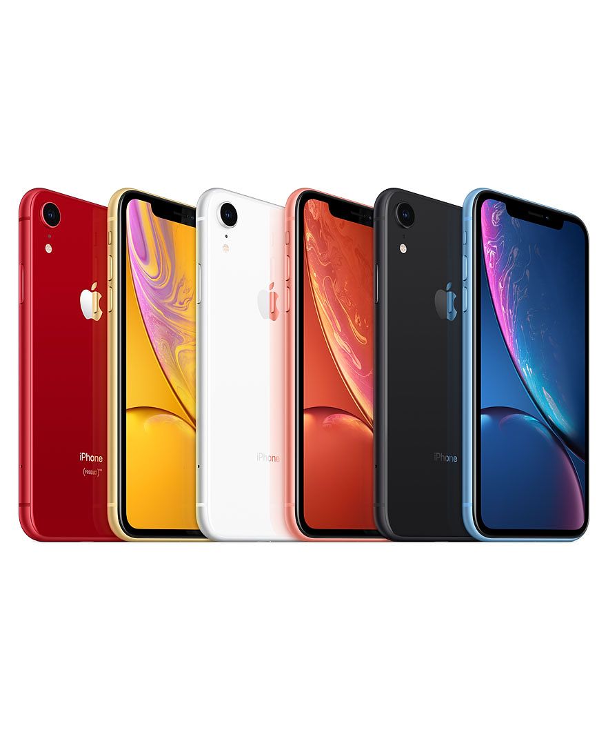
iShop (2019). iPhone XR [Photograph] retrieved from https://ishop.gt/products/iphone-xr
LappyPhone (2019). Apple refreshes the MacBook and MacBook Air laptops [Photograph] retrieved from http://www.lappyphone.com/2016/04/apple-refreshes-macbook-and-macbook-air.html
Pinterest (2019). Adobe Creative Suite Vector Icon [Photograph] retrieved from https://www.pinterest.com.au/pin/664984701199838376/
Getpcsoft Wikisend (2019). Adobe Photoshop Lightroom [Photograph] retrieved from https://getpcsoft.wikisend.com/adobe-photoshop-lightroom-free-download.html
Cracked How (2019). Adobe Photoshop CC v20 Crack (2019) Full [Photograph] retrieved from https://crackedhow.com/adobe-photoshop-cc-crack-2019-v20-windows-upgrade/
Facebook Brand Resource Center (2019). Facebook brand assets [Photograph] retrieved from https://en.facebookbrand.com/#brand-guidelines-assets
MakerMoon (2019). Facebook cover video maker [Photograph] retrieved from https://www.google.com/search?biw=1631&bih=876&tbm=isch&sa=1&ei=DkjyXI2vIsy9rQGg-6HgBg&q=facebook+template+of+feed+&oq=facebook+template+of+feed+&gs_l=img.3..35i39.16318.16921..17143…0.0..0.180.693.0j4……0….1..gws-wiz-img.XFMvc7D8UfM#imgrc=-B-vVI-PzesULM:
PERFORMANCE LOAD – WEEK 3
QUESTION 1
The article discusses the performance load when one is trying to achieve a particular goal. In the introduction of the article the author clearly states the two types of loads: cognitive load and kinematic load. Overtime, as technologies have developed there has been a reduction in the cognitive load which reduced the mental effort required by users to work systems such as computers.
As an example, early computer systems when first introduced, required users to remember large sets of commands and data and then enter them in manually to the computer- users required more mental energy then they do now which significantly presented an increase the cognitive load. Through the evolution of media technologies overtime, computers have reduced the work required by the user and rather made more efficient and effective machines for users and hence it became a mass market technology.
Cognitive load theory states that because short term memory is limited, learning experiences should be designed to reduce working memory load In order to promote more efficient learning by users (Hieck, 2017). Therefore, designs should avoid overloading it with additional activities that won’t contribute to the users learning, hence why computer designs have produced clear and straight forward machines which allow users to access and enter data. If the cognitive load becomes too much for a person to absorb, they may experience ‘cognitive overload’ where the individual is left in a situation where they can no longer process all the information (Mayer & Moreno, 2003)
Thus, if cognitive load is too high, it can have negative impacts on learning, so activities that especially acquire the use of memory, such as learning a new language, is dependent on the cognitive load staying at a tolerable level (Zhang, 2013).
The article covers another type of performance load, being kinematic load, which is the amount of physical activity done by users- in regards to the number of steps, movements and amount of force which has been used to achieve a certain goal. They explain this idea through the communication format, the telegraph. In this case the number taps were sent between people one at a time to communicate a message is equivalent to the kinematic load for that particular task.
Another form of communication which was designed to reduce the kinematic load was Morse code- which also minimised the transmission times and error. Overall, the aim in reducing the kinematic load is by reducing the number of steps and distance required to complete tasks by users (Lidwell, Holder and Butler, 2003, p. 148). The point of view of the author is the perspective that designs should minimise these loads in order to achieve goals more efficiently.
Cognitive load should be reduced through eliminating unnecessary information and rather grouping this information so it’s clear and to the point and kinematic load should be reduced by minimising the physical effort required through reducing overall motion and energy used.
QUESTION 2
Chunking information in relation to design and visual communication is described as a memory aid to assist in complex tasks which reduces the cognitive load by eliminating unnecessary information, “initially separate processes are grouped together and dealt with as simple wholes” (Morrison, 1991). The technique of chunking information in relation to the cognitive performance load as “taking individual pieces of information (chunks) and grouping them into larger units” (Cherry, 2016). Seen through digital design on websites and platforms where users search for information- the technique of chunking is used to group large bits of relevant information making it aesthetically clear for readers to identify.
This technique of chunking is very relevant to design and visual communication as it is put to use in attempt to reduce the readers’ cognitive load, enabling them to absorb more information with ease (Lidwell, Holden & Butler, 2003). Used in this context, it is recommended that a paragraph contains no more than one idea as people are known for scanning over information on the internet, and this is an easier way to recognise the key concepts.
Chunking is an effective tool in relation to design and visual communication as it is a powerful way of improving one’s performance of memory and recall, rather than trying to take in immense amounts of unstructured information in one sitting (Huntley et al, 2011).
QUESTION 3
Psychology would obviously be a necessary field of study in regard to this topic of performance load. This is because psychology is very relevant in the way that performance load involves our mental (cognitive) capacity to complete a task, because it is in this way that designers can understand that by implementing strategies and approaches in attempt to reduce performance load.
They are further aiding the involved people to absorb more information by seemingly doing less and thus reducing the cognitive load (Lidwel, Holden & Butler, 2003). This would in turn create more effective visual design rather than a design that is difficult to understand and inconvenient to use due to things like too many steps to try and remember, which would increase the overall performance load.
QUESTION 4 – IMAGES
ITUNES
(iTunes, 2019)
iTunes I use on a daily basis that satisfies the principle of performance load, as it creates a series of categories to distinguish apps and products from one another. The have chucked various genres of music together using colour and images as a visual engaging aspect to the platform, therefore allowing a simple process of purchasing the content. Hence the iTunes store uses both cognitive and kinematic load successfully.
(Google, 2019)
Google is used on a daily basis and is an example which satisfies the design principle of performance load as it is reducing unnecessary steps in a task to bare minimum, thus reducing the kinematic load.
NAB (National Australian Bank Website)
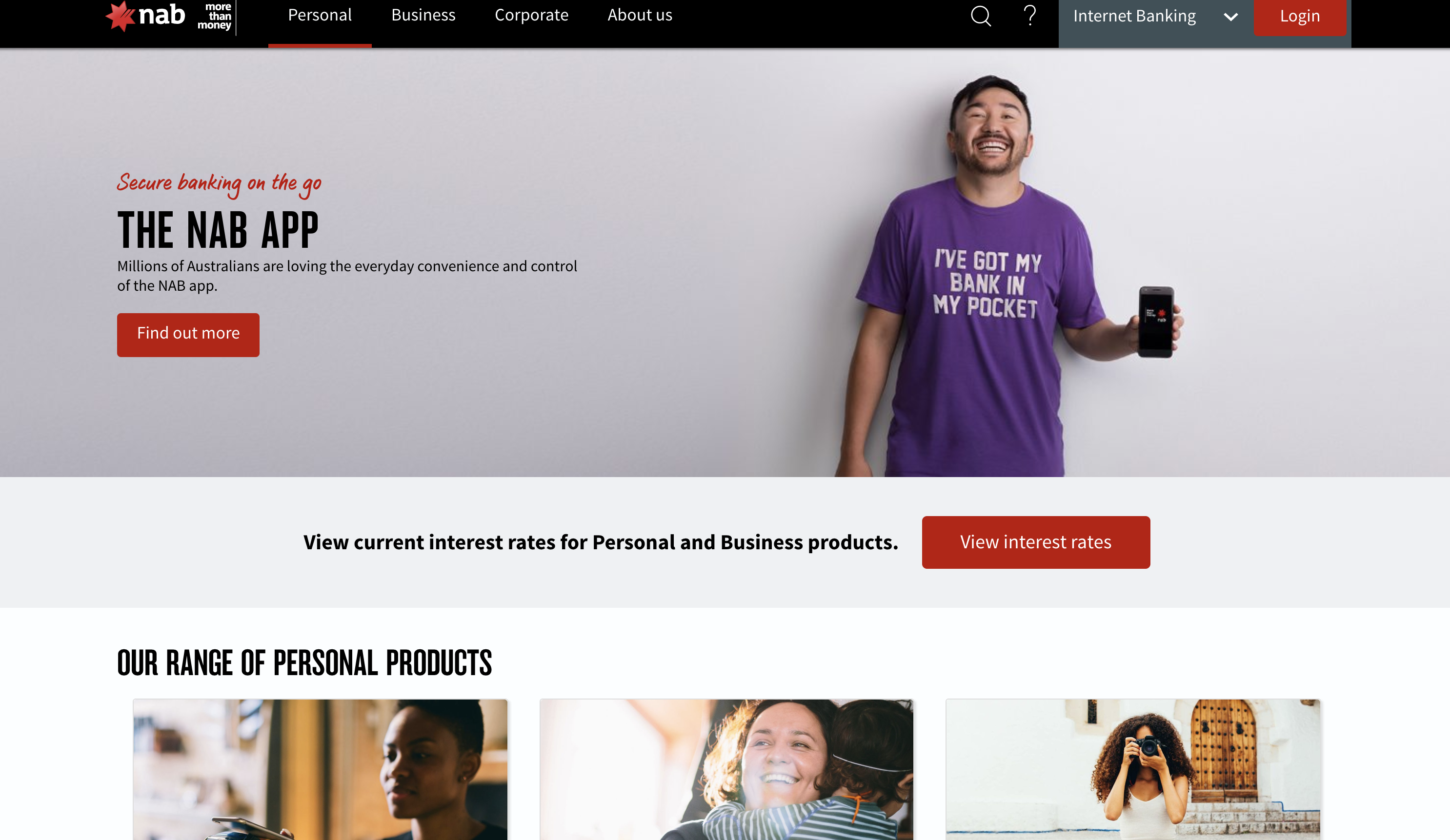
(NAB , 2019)
NAB’s website is is an example of reducing the cognitive load as the website has reduced its information to minimum so it is easy to read and process. Users are able to browse the plaform efficiently without any complications or confusion.
References
Huntley, J., Bor, D., Hampshire, A., Owen, A., & Howard, R. (2011). Working memory task performance and chunking in early Alzheimer’s disease. The British Journal of Psychiatry, 195(5), 398-403.
Lidwell, W., Holden, K., & Butler, J. (2003). Aesthetic‐Usability Effect. In Universal Principles of Design (pp. 46). Massachusetts: Rockport.
Zhang, J. (2013). Decreasing Cognitive Load for Learners: Strategy of Web-Based Foreign Language Learning. International Education Studies, 6(4), 134-139.
Morrison, J. (1991). Training for performance: principles of applied human learning. West Sussex, England: John Wiley & Sons Ltd.
Cherry, K. (2019). How the Chunking Technique Can Help Improve Your Memory https://www.verywellmind.com/chunking-how-can-this-technique-improve-your-memory-2794969
Heick, T. (2017). What Is The Cognitive Load Theory? A Definition For Teachers. https://www.teachthought.com/learning/cognitive-load-theory-definition-teachers/
Mayer, R., & Moreno, R. (2003). Nine ways to reduce cognitive load in multimedia learning. Educational Psychologist, 38(1), 43-52.
Image References
iTunes (2019). [Screenshot] retrieved from iTunes.
Google (2019). Google Homepage [Screenshot] retrieved from https://www.google.com/
NAB (2019). NAB Homepage [Screenshot] retrived from https://www.nab.com.au/
CREDIBILITY – WEEK 4
QUESTION 1
Fogg (2003) states that “credibility can be defined as believability”. It is highly important that individuals evaluate credibility- or believability- of websites. If the credibility of websites are in fact not evaluated we could be obtaining in actuate and false information and hence this could continue if not acted upon. Therefore it is vital for individuals to evaluated the credibility of the sources they collect information from on the internet. This is achieved by looking for logos and hints that the website legible and created by real website creators, author or organisation, further research into authors education and qualification to discuss the particular topic.
If so, making sure the creators are qualified in that particular field and also looking out for sponsorships and links to other organisations (Long & Chiagouris, 2006). Additionally, a websites aesthetic design can indicate its credibility. First impressions of the websites overall look and style heavily influences the websites success and if a user continues to gather information from that particular website, it is found that within 3.42 seconds, a person has judged the credibility based on the appearance of the website alone (Glore & David, 2012).
Credibility of websites could affect students, as they are constantly searching for sources as a part of their work. If students were obtaining false formation they would essentially fail to broaden their knowledge effectively. This would also have a negative impact on their work and the quality of information provided in their assignments.
QUESTION 2
Wikipedia is not an accepted credible resource due to the fact that any online user can change the content displayed- anyone has access to corrupt or produce false content, therefore pieces of information written might not be in fact the truth and are therefore not credible to use as a source of information for academic assignments. Though wikipedia is perceived as a great source for quick information to get a general questions or topics that users might be searching, however, “when you’re doing academic research, you should be extremely cautious about using Wikipedia.” (“What’s Wrong with Wikipedia?
Harvard Guide to Using Sources”, 2016). As its own disclaimer states, “Wikipedia is not considered a credible source.” (“Academic use”, 2016). All these key factors mean that the site’s trustworthiness is hampered with, as no one can guarantee that the site’s content is “truthful, fair and unbiased” (Fogg, 2003).
This is why students are urged to use credible scholarly websites, books and academic articles rather than Wikipedia and similar sites, to ensure that only qualified and credible people are presenting the information to ensure that this information be accurate and reliable.
QUESTION 3
- If a website has links on the page that take you to the error 404 page meaning the links are either missing or don’t work, or the links take you to other pages that appear unreliable, this can make users perceive the website as unreliable.
- If the site also has a difficult navigation menu bar that’s not visibly at the top of the page or down the side of the website format, this can also be seen as unreliable as users wont waste their time searching.
- At the bottom of a site you can see how often it gets updated, the most credible sites have been updated within the current year and year before, if they haven’t been updated for example, from 2000, this could be seen as unreliable as content needs to be updated with new information, especially if its information you will be using in an academic assignment.
- If the site your using has automatic pop-up windows, even when you have set in your browser settings to disable pop-ups, and particularly if these pop-ups are ads for potential virus contained website, this site would be considered unreliable and shouldn’t be used in the future.
QUESTION 4 – IMAGES
Presumed– ECU Website
An example of presumed credibility would be the ECU website, as a presumed credible website is one that refers to, “the trust we give to someone or something because of the general assumptions we hold.” (Papantoniou, 2016). Therefore university websites would show a more trust worthy site than course provider websites. Due to the website allowing contact information, a physical address, a professional appearance etc. the ECU website is a perfect example of a presumed credibility website.

(ECU, 2019)
Reputed– HBF Website
An example of reputed credibility site would be the HBF website, as this type of credibility is one that has “referenced from third parties… to persuade users to trust you.” (Papantoniou, 2016). Hence why the HBF website is considered a reputed credibility site as it contains information at the bottom by people who support them.
(HBF, 2019) 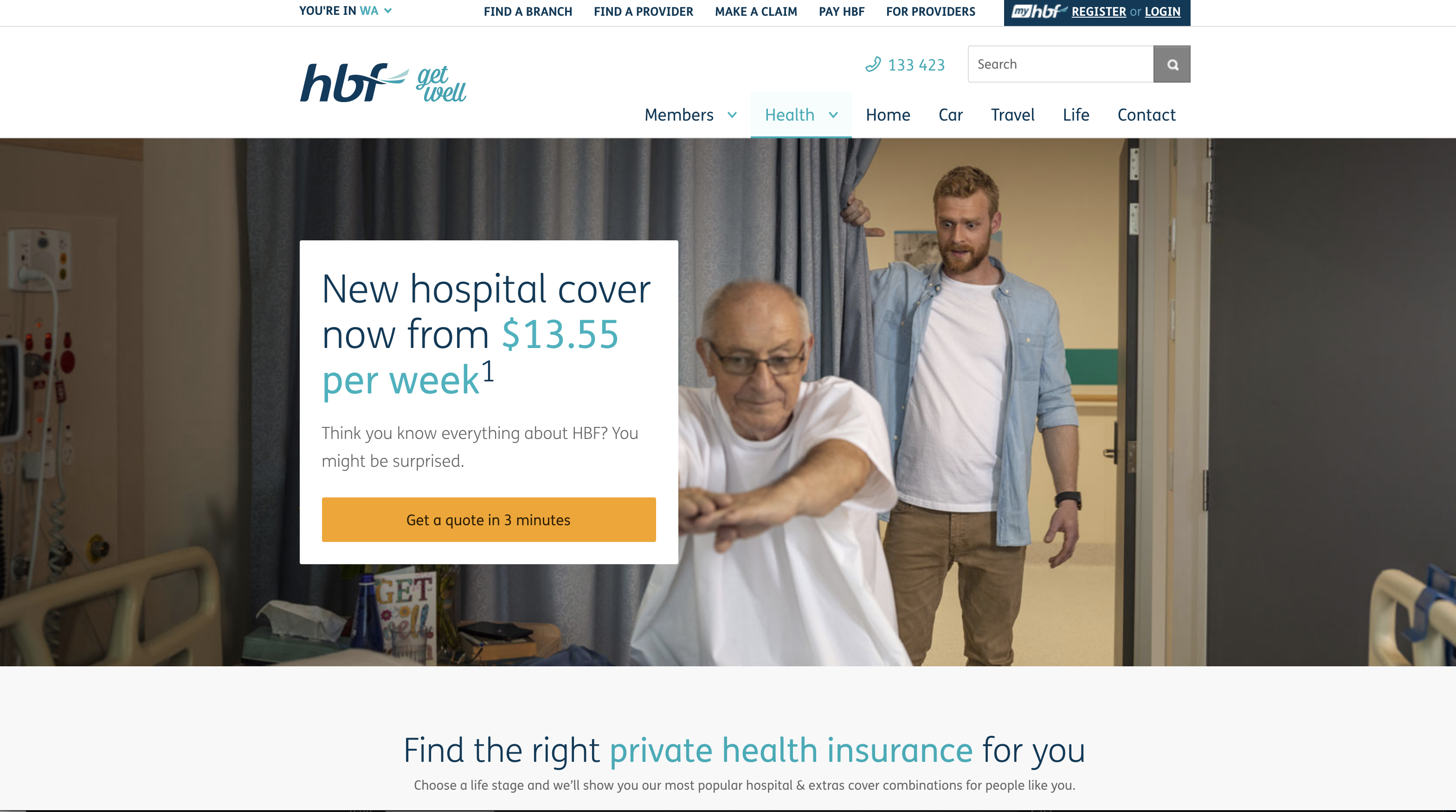
(HBF, 2019)
Surface– NAB Website
An example of surface credibility site would be the NAB website as this type of credibility is one about, “great visual design and exceptional content. It’s the first impression we get from the site after a simple inspection.” (Papantoniou, 2016) Therefore due to NAB’s professional visual design and prominent logo, including relevant information, it completely conveys as an example of surface credibility, as users would completely trust this website due to these factors.

(NAB, 2019)
Earned– Google Scholar
Earned credibility refers to, “credibility that is earned by great user experiences after multiple visits. Usability, up-to date information and great customer servie are a must.” (Papantoniou, 2016). Therefore I believe Google scholar is a great example of earned credibility, as the are one of the most frequently visited sites for academic information global rather to a website like Wikipedia which isn’t as credible.
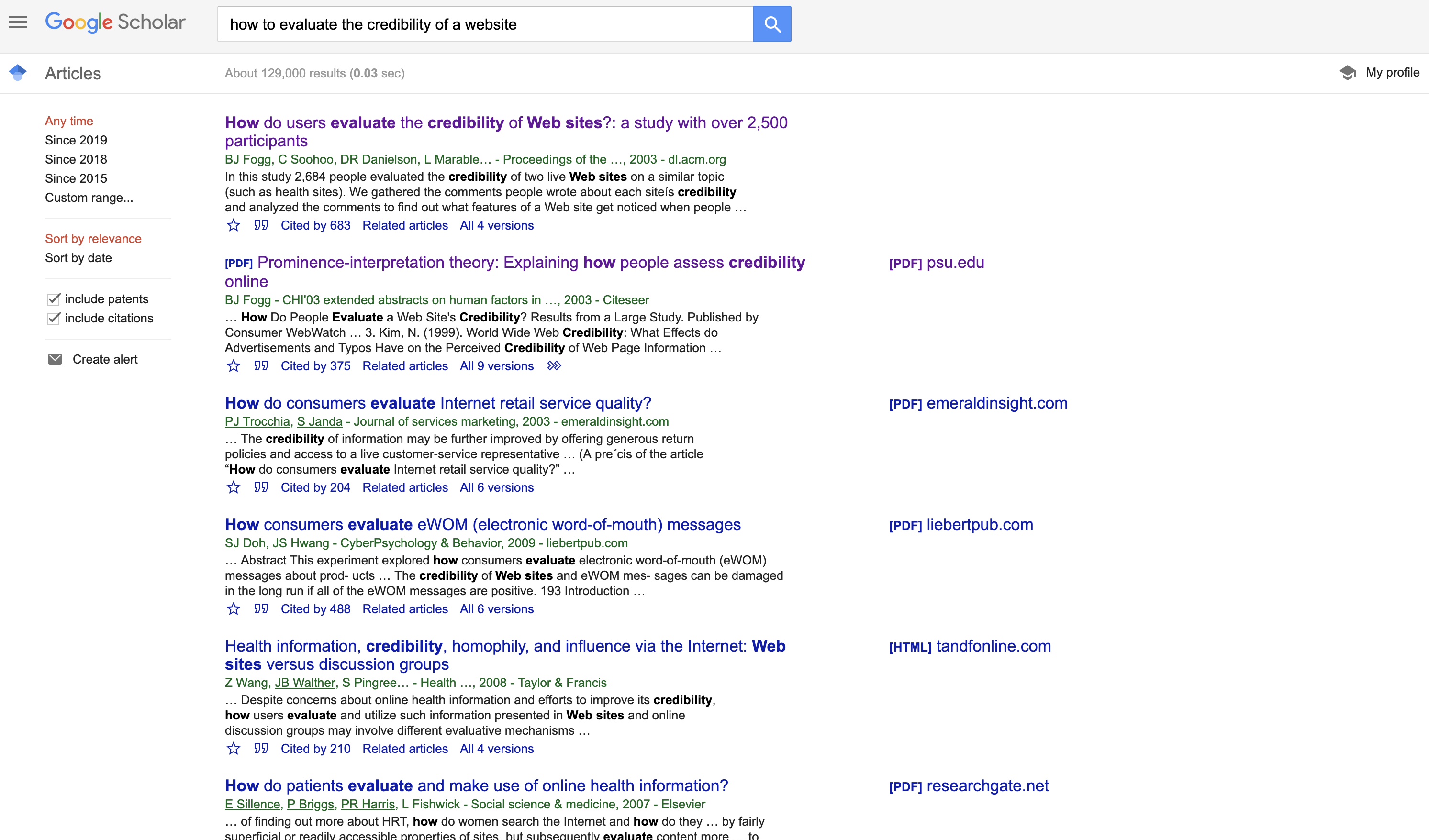
(Google Scholar, 2019)
References
Fogg, B. J. (2003). Credibility and the World Wide Web. In Persuasive Technology: Using Computers to Change What We Think and Do (pp. 122‐125). Amsterdam: Morgan Kaufmann Publishers.
Papantoniou, L. (2011). Do you trust me? Assessing Web Credibility. Usabilla, 1-10. Retrieved from http://blog.usabilla.com/do-you-trust-me-assessing-online-credibility/
Glore, P. & David, A. (2012). Design and Aesthetics in E-Learning: A Usability and Credibility Perspective.International Journal on E-Learning, 11(4), 383-390.
Long, M,. & Chiagouris, L. (2006). The role of credibility in shaping attitudes toward nonprofit websites. Int. J. Nonprofit Volunt. Sect. Mark, 11, 239–249.
Image References
Google Scholar (2019). Google Scholar Homepage. Retrieved from https://scholar.google.com.au/
NAB (2019). NAB Homepage. Retrieved from https://www.nab.com.au/
HBF Private Health Insurance (2016). HBF Homepage. Retrieved from https://www.hbf.com.au/health-insurance?cmpid=sem:goo:241272748041&s_kwcid=hbf&kwmt=%7bmatch%20type%7d&ds_rl=1239524&ds_rl=1239524&ds_rl=1239524&gclid=Cj0KCQjwxMjnBRCtARIsAGwWnBPDyHStTO3pT-w78qwyJiO5FyPDCTQOhwNtMgWk2xcVKGsoM7obrtgaAh2xEALw_wcB&gclsrc=aw.ds
ECU (2019). ECU Homepage. Retrieved from https://www.ecu.edu.au/
